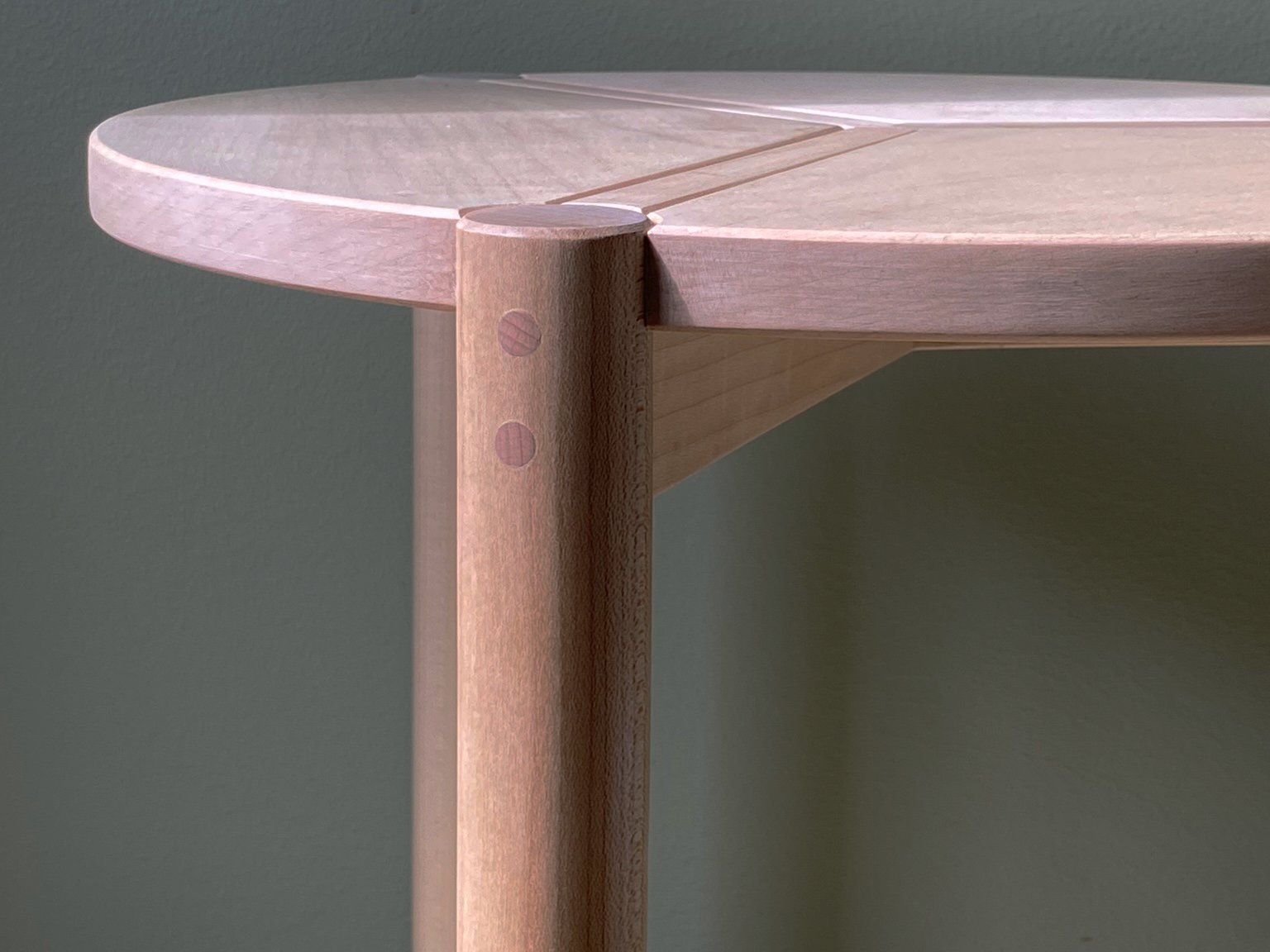
Riley Table
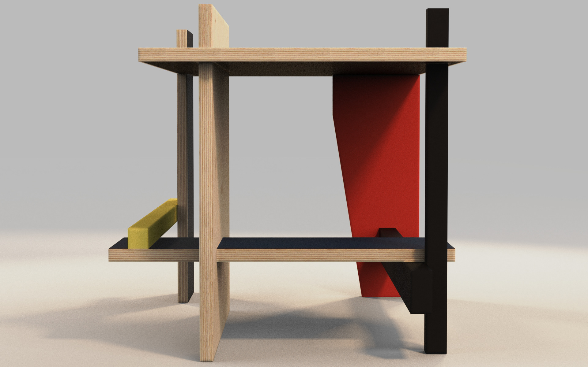
The task was to take a piece of furniture from history and design a new product using the principles of the precedent. From studying the foundations of the Berlin Chair, and the De Stijl movement in general, the Riley Table was born.
Historical Transformation
After the design of the Red-Blue chair (1917), Gerrit Rietveld continued his stylistic exploration under De Stijl with the Berlin Chair. The chair was designed in 1923 for the ‘Juryfreie Kunstschau’ in Berlin.
The use of flat panels defines this piece. Because of this, the chair was also referred to as ‘the plank chair’. A system of interrelated planes was created and balanced asymmetrically. Because it was to be placed in a dynamically colored model room (far right), the palette of the chair was reduced to black, grey, and white.
Design Focuses
Simplicity | Integrity | Hierarchy
Plank Integrity
Because such care was taken to preserve the integrity of the planks in the design of the Berlin Chair, the same care is taken in the ‘disassembly’ of the chair. Each piece is catalogued with a number based on position in the chair. From here, pieces are separated in their entirety and grouped by the color of the lacquer finish in the original chair.
Ideation
A look at my initial thoughts and how they landed on the page.
Manipulation of Plane
Scale is manipulated to bring the assembly to the size of an occasional table. Piece 2 is scaled up to create the table top surface while piece 6 is scaled down to create storage beneath.

Elements in the original chair

Elements after scaling
Table Assembly
Connections
Connections are hidden to maintain the integrity of the planes. Piercing connections are made possible by shoulders pocketed into the punctured element. Face to face interactions are outfitted with dominoes. Both of these details are meant to increase surface area for adhesives that hold the piece together.
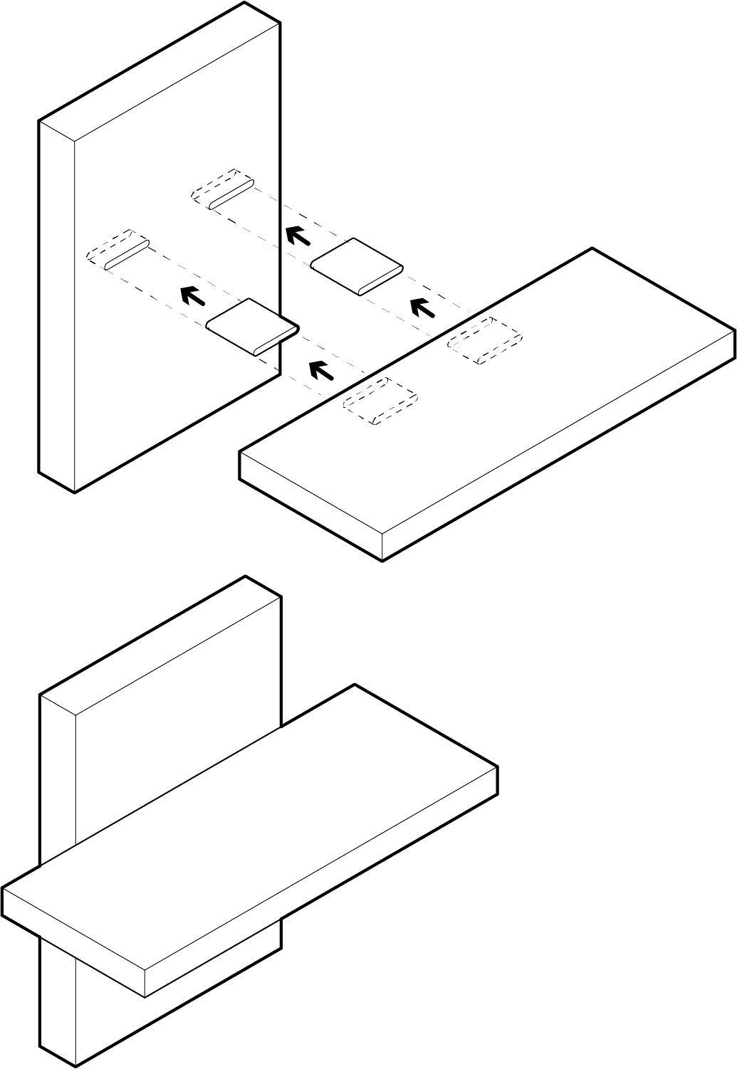
Domino Face-Face Connection
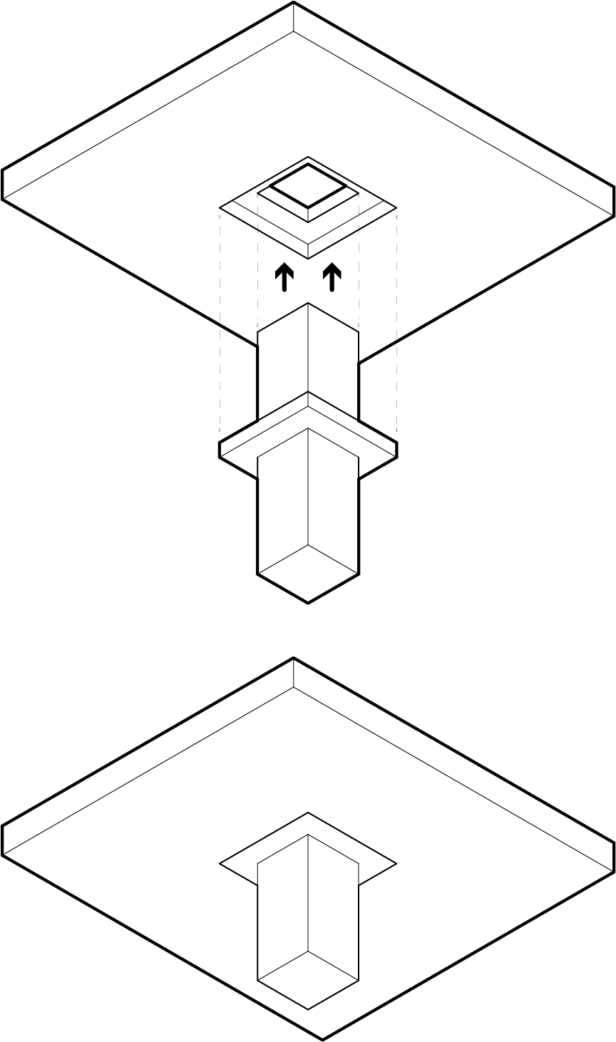
Piercing Shoulder Connection
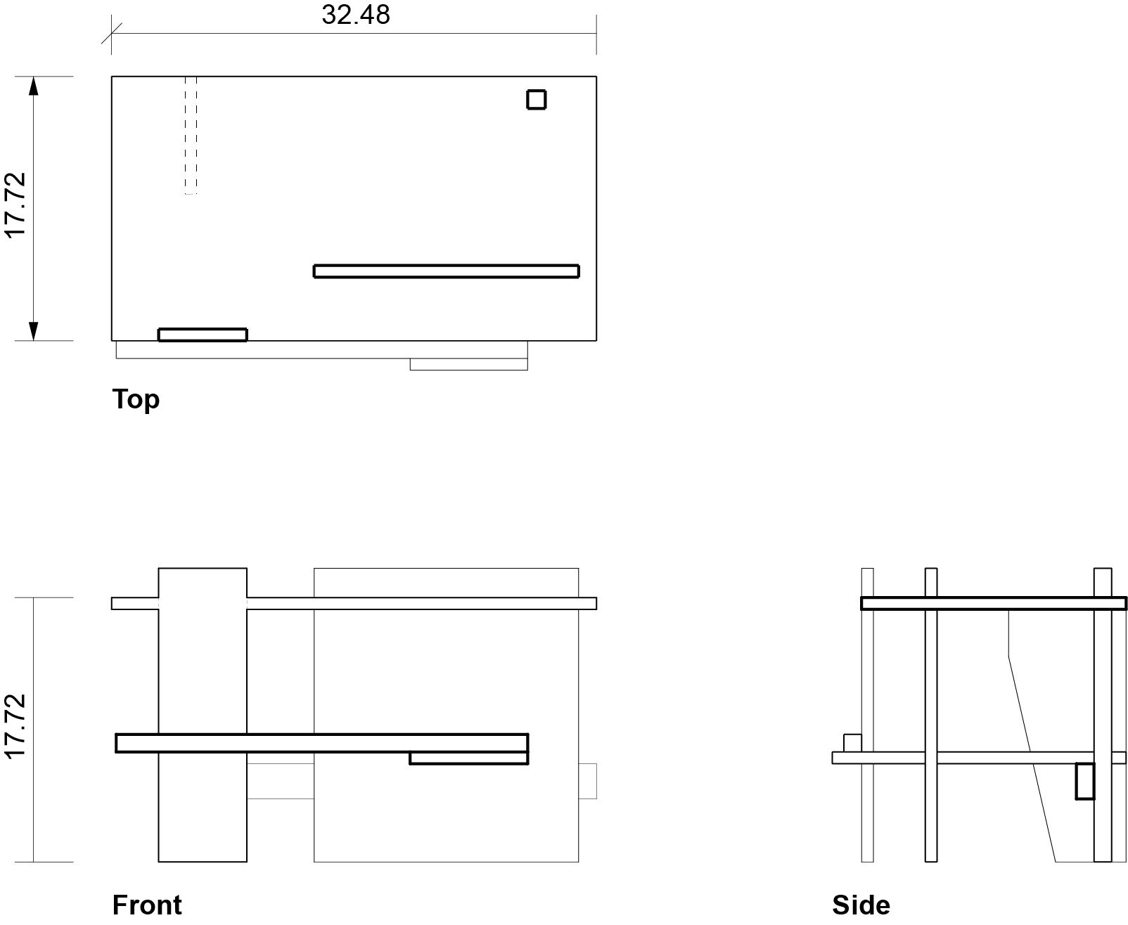
Orthographic Drawings
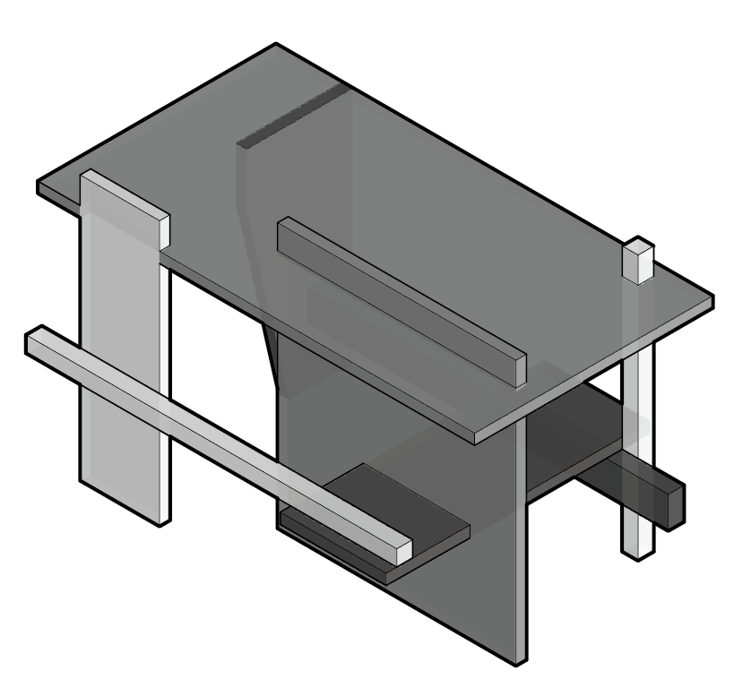
Isometric Drawing
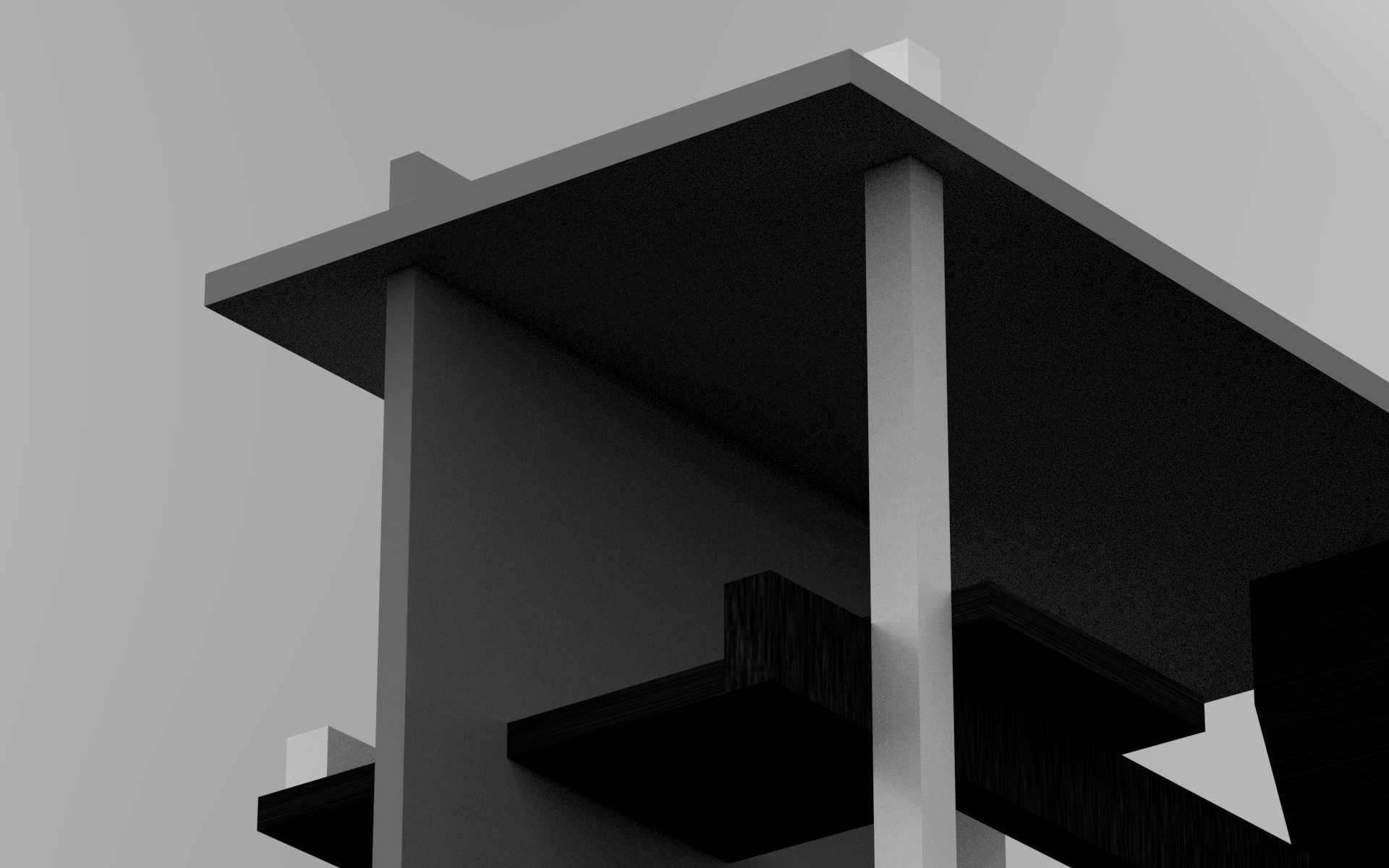
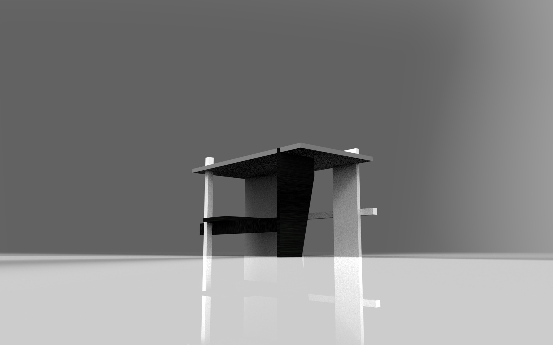
Form studies

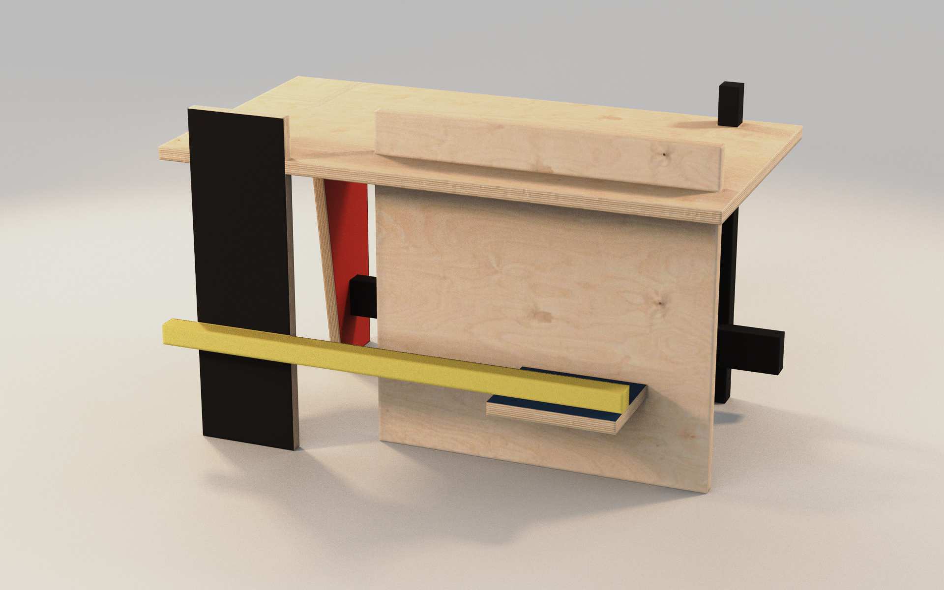
Color + Materiality

Graphic Presentation
A simplistic marketing poster.


